Charts / Trends
Charts enable you to study your sleep from a long-term perspective.
Charts are here to help you find patterns in your sleep and enable you to decide for evidence-based changes.
Left ☰ menu → Charts
Each chart is computed from data within a certain date range. This range is controlled by the first dropdown menu in the top bar.
All charts can be configured to be only computed from sleep records with a certain tag. You can select the tag in the second dropdown menu in the top bar.
- 1. Trend
- 1.1. Sleep score
- 1.2. Deficit
- 1.3. Duration
- 1.4. Regularity
- 1.5. Regularity index
- 1.6. Regularity index (+/-)
- 1.7. Deep sleep %
- 1.8. Deep sleep
- 1.9. Awake
- 1.10. Efficiency
- 1.11. Snoring %
- 1.12. Snoring
- 1.13. Graphs
- 1.14. Fall asleep hour
- 1.15. Smart wakeup
- 1.16. Snooze
- 1.17. HRV
- 1.18. HRV Gain
- 1.19. HRV Before wake up
- 1.20. Respiratory disturbances
- 2. Tags
- 3. Chronotype
- 4. Advice
1. Trend
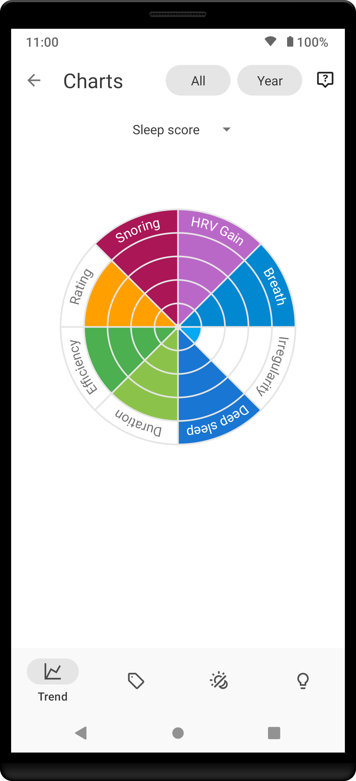
1.1. Sleep score
|
Sleep score radar chart is another way of looking at your sleep score.
How should it look? The more the merrier - goal is of course to fill up that chart completely! |
1.2. Deficit
|
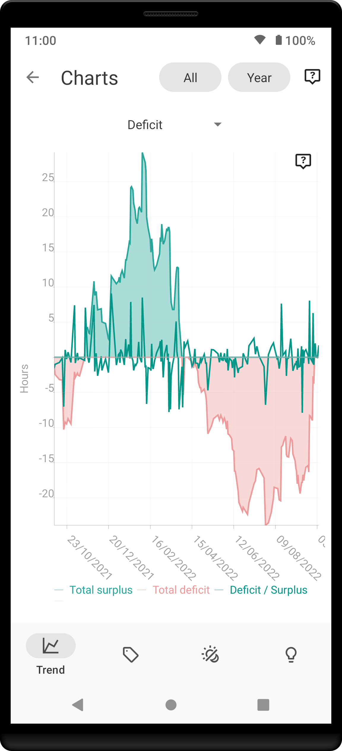
Deficit chart is useful for tracking your sleep deficit.
How should it look? You should strive to have zero sleep deficit, so ideally all of the lines should aim to be close to 0. |
1.3. Duration
|
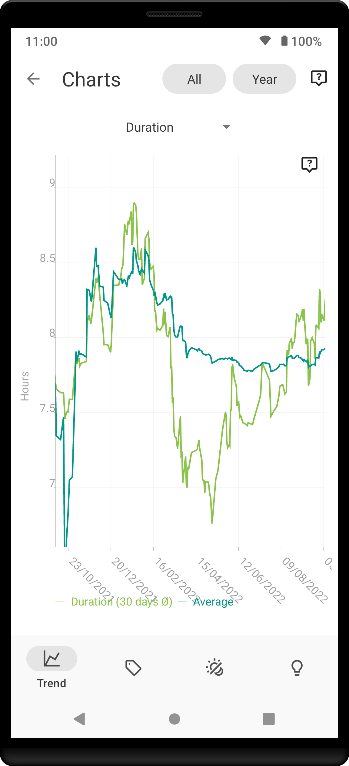
Duration chart shows you the evolution of your sleep lengths.
How should it look? The chart should not have many extremes (regular, periodic chart is normal). |
1.4. Regularity
|
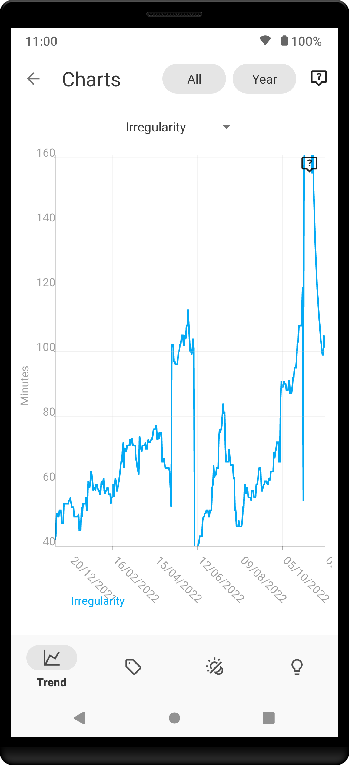
Regularity chart shows you how much is your sleep irregular.
How should it look? While some irregularity is normal, you should strive to keep it to minimum - keep the line at low values. |
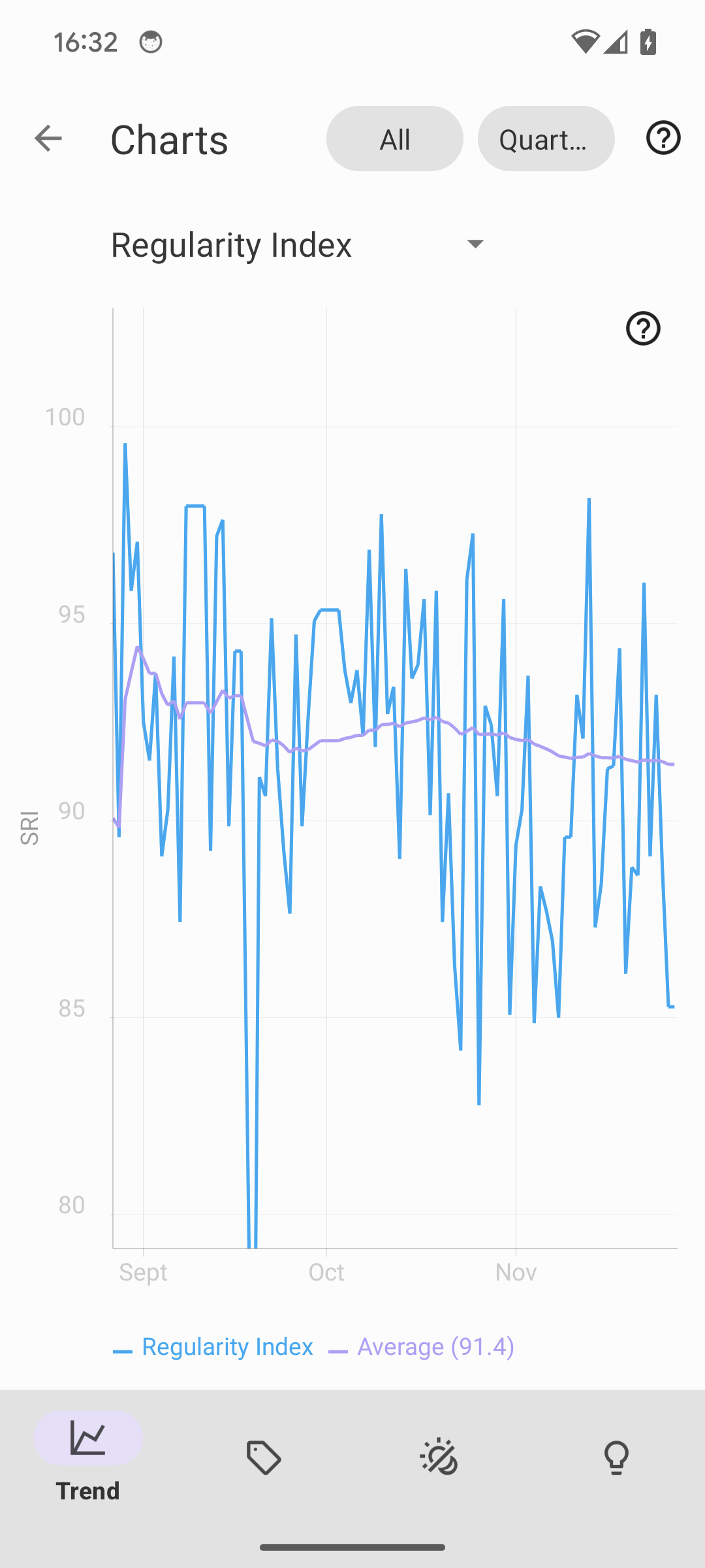
1.5. Regularity index
|
Regularity Index chart shows you the Sleep regularity Index.
How should it look? Ideally, your SRI is kept high close to 100%. The SRI of 100 means your asleep and awake times where absolutely identical between two consecutive days. Values above 80 are considered as regular sleep. |
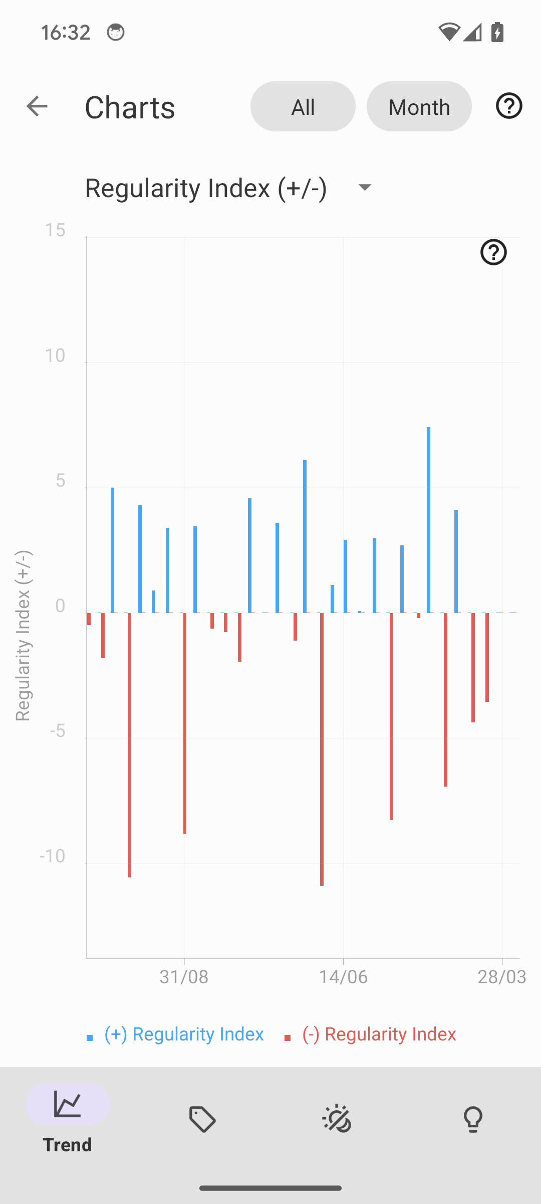
1.6. Regularity index (+/-)
|
Regularity Index (+/-) chart shows you the increase/decrease of the Sleep regularity Index from your average (see details about SRI here).
How should it look? Your ideal graph shows minimum fluctuations, no significant increases or decreases. |
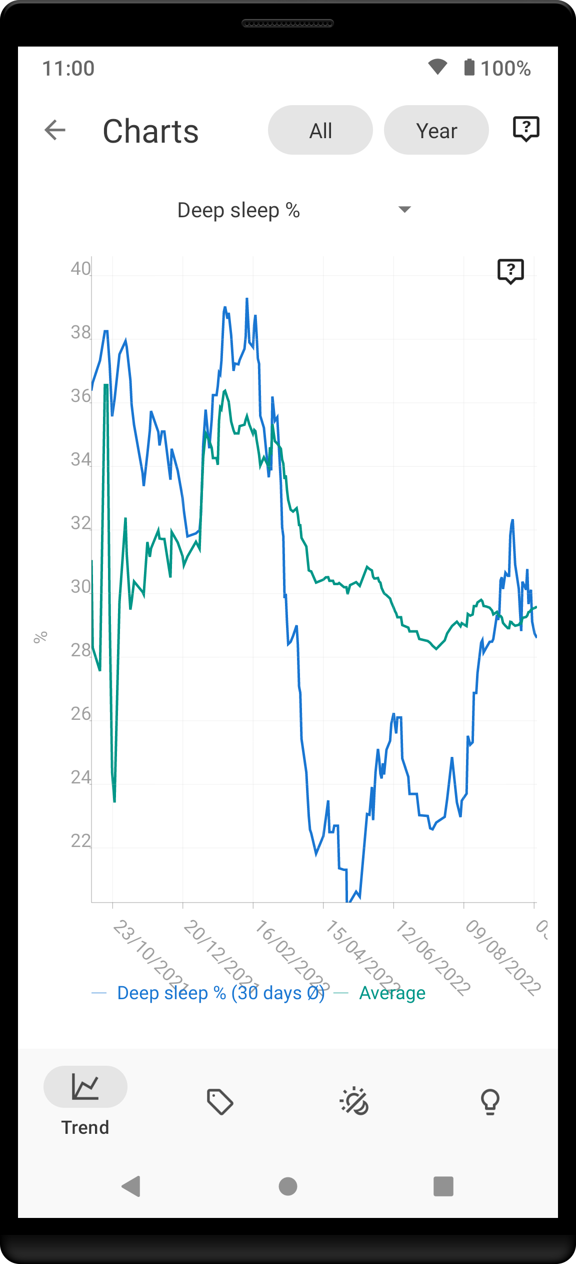
1.7. Deep sleep %
|
Deep sleep % chart shows you how your deep sleep percentage has been changing recently – effectively how well did you sleep.
How should it look? The average should be kept over 30%. |
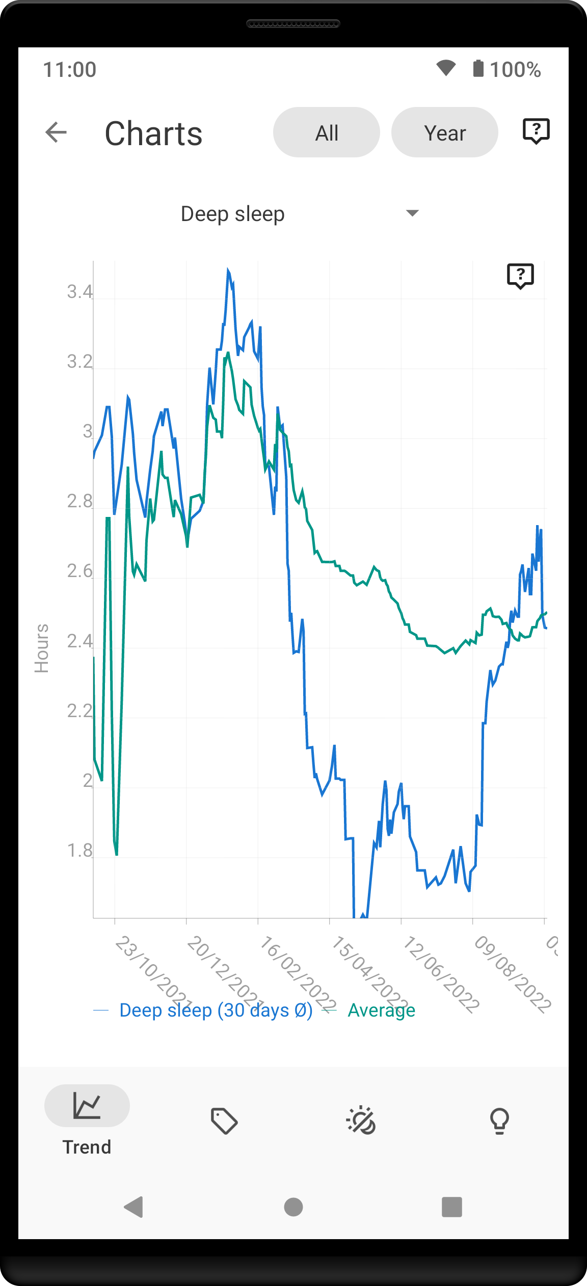
1.8. Deep sleep
|
Deep sleep chart shows you how your deep sleep duration has been changing recently.
How should it look? The graph should not have many spikes - ideally should be regular, flat line, above 2 hours. |
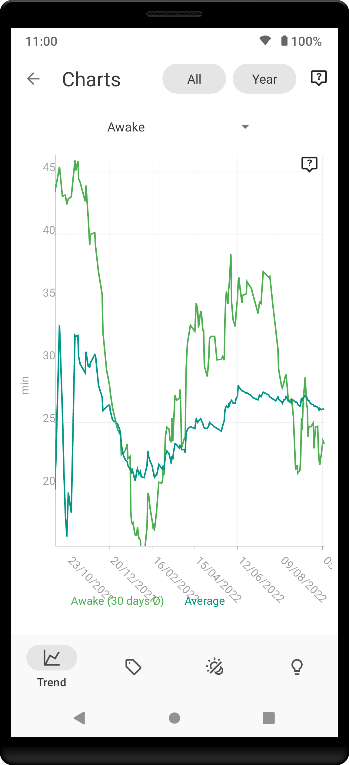
1.9. Awake
|
Awake chart shows you how much you’ve been waking up during your sleep.
How should it look? In an ideal world, you should not wake up at all during sleep -this means a flat line at the bottom. |
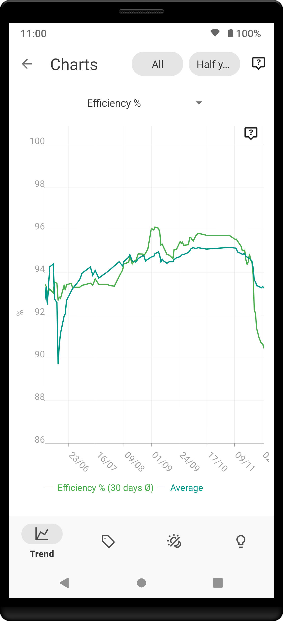
1.10. Efficiency
|
Efficiency chart shows the ratio of actually sleeping when you’re in bed (sleep duration to tracking duration).
How should it look? Ideally a line reaching the 100% value most of the times. |
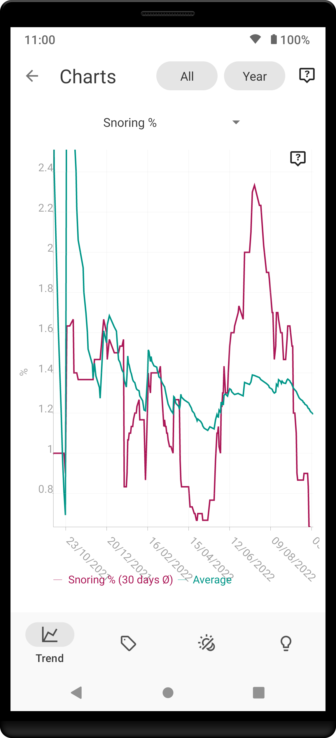
1.11. Snoring %
|
Snoring percentage chart shows how much of the time you sleep did you spend snoring.
How should it look? Ideally a flat line close to 0%. |
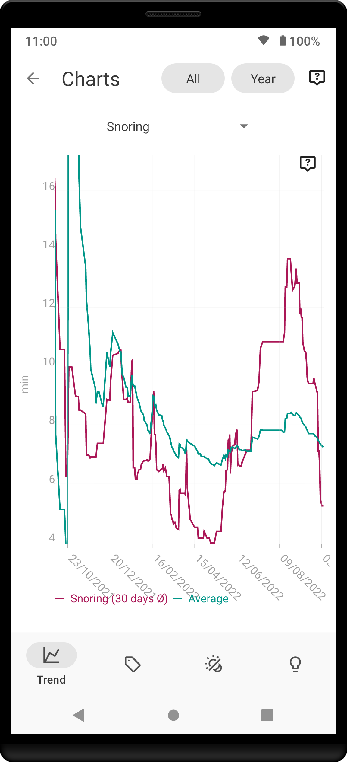
1.12. Snoring
|
Snoring chart shows how much time did you spend snoring.
How should it look? Ideally a flat line close to 0 minutes. |
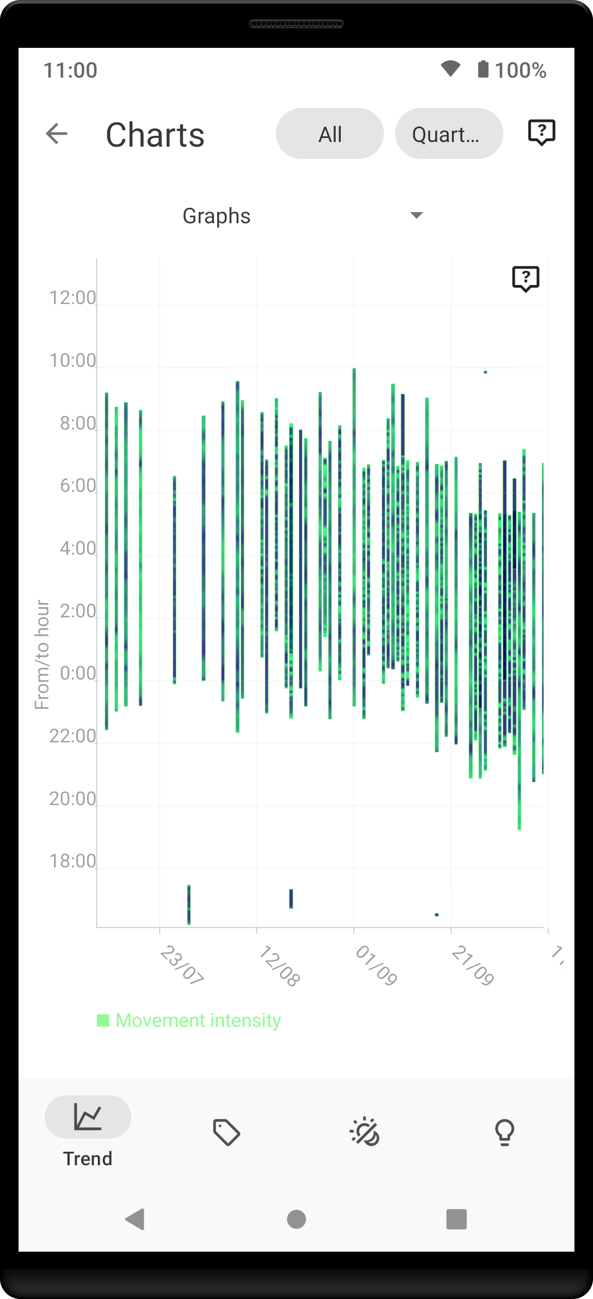
1.13. Graphs
|
Graphs, or "sleep bars", show the intensity of movement during sleep.
How should it look? As the sleep bars are just another view at the actigraph, they should ideally follow the same rules as the actigraph: they should show regular sleep cycles that get shorter towards the end of the sleep. |
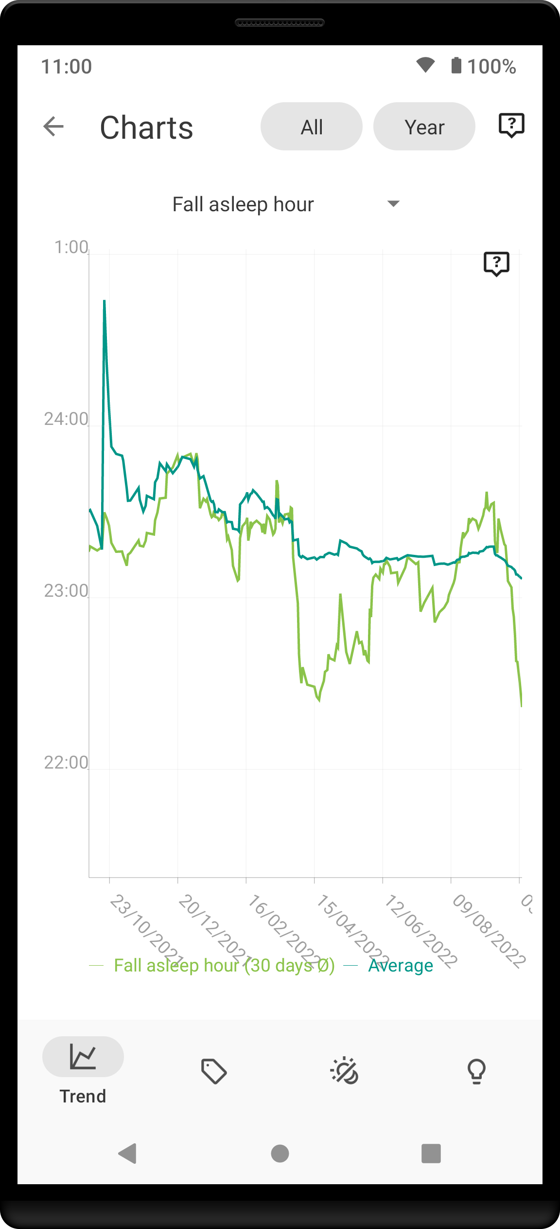
1.14. Fall asleep hour
|
Fall asleep hour chart shows when you’ve been going to bed.
How should it look? Ideally a flat line with minimum spikes. |
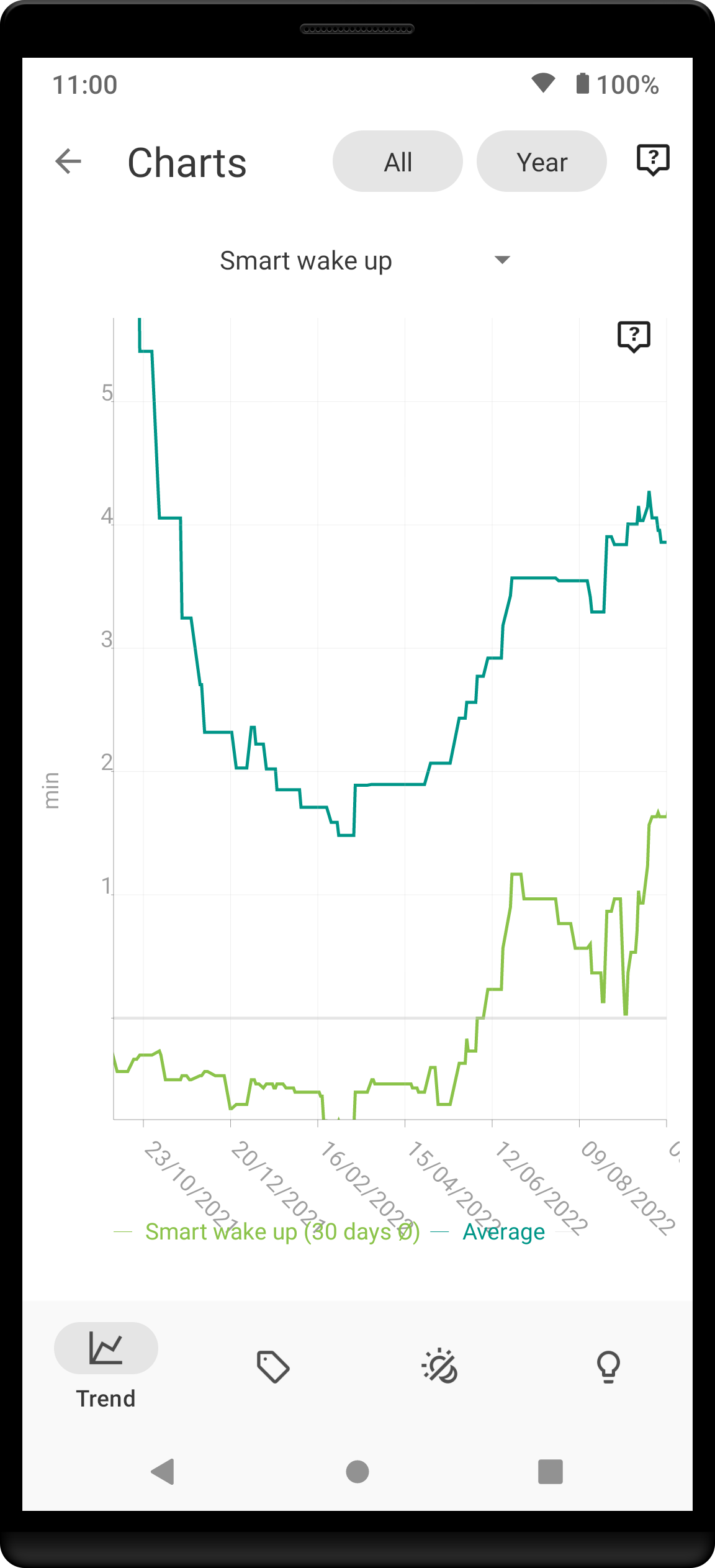
1.15. Smart wakeup
|
Smart wakeup shows how many minutes before the set alarm did smart wake up wake you up.
How should it look? It should be consistently between zero and your set smart period. If it’s at one of the extremes, you should adjust the smart wakeup sensitivity. |
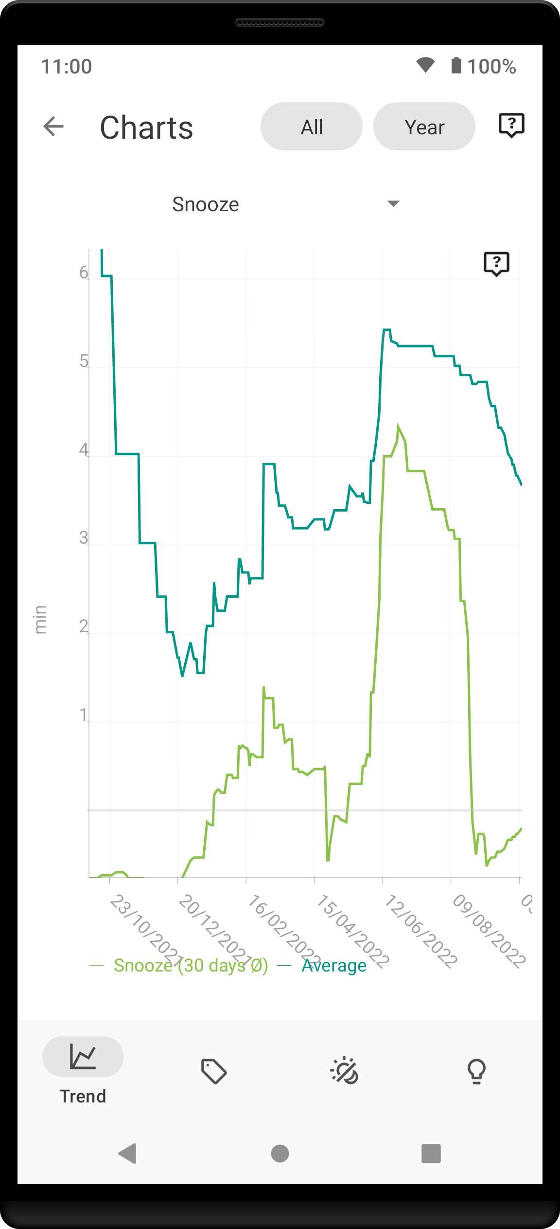
1.16. Snooze
|
Snooze chart shows how many minutes you’ve been snoozing your alarm.
How should it look? There are no hard and fast rules on snoozing, but it sure is a sign of a strong willpower to keep it at zero. |
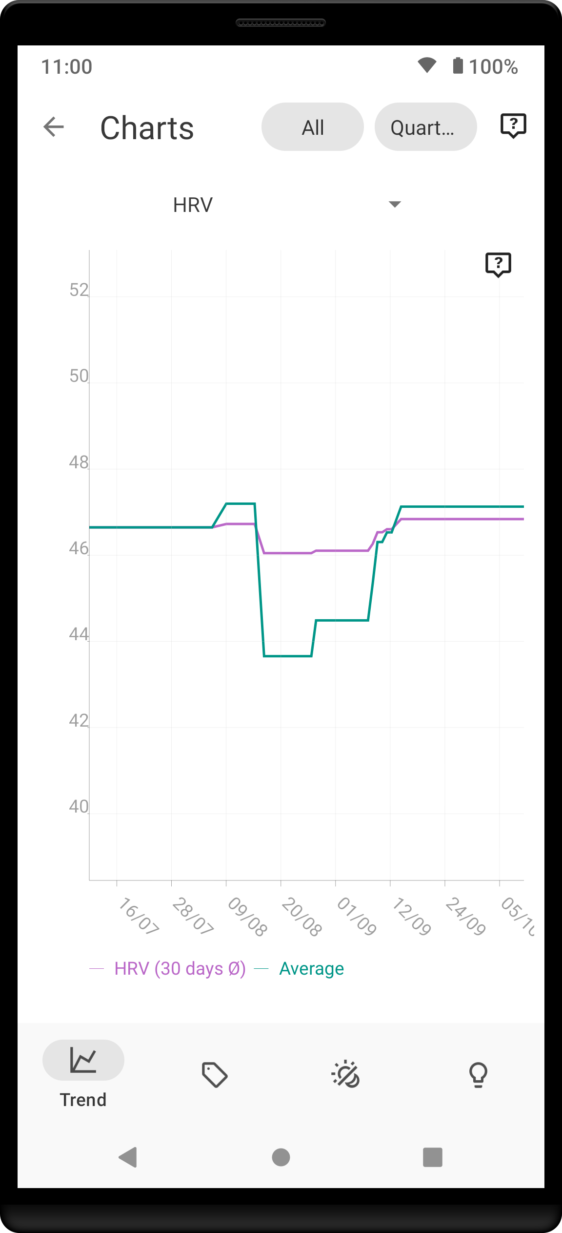
1.17. HRV
|
HRV chart shows total amount of heart rate variability throughout the entire night, including all the local minima and maxima.
How should it look? Generally, the higher the better, but ideal HRV is highly individual - your age, gender, fitness level, and fitness activity play the key roles. You should be looking for increasing trend in your HRV data. |
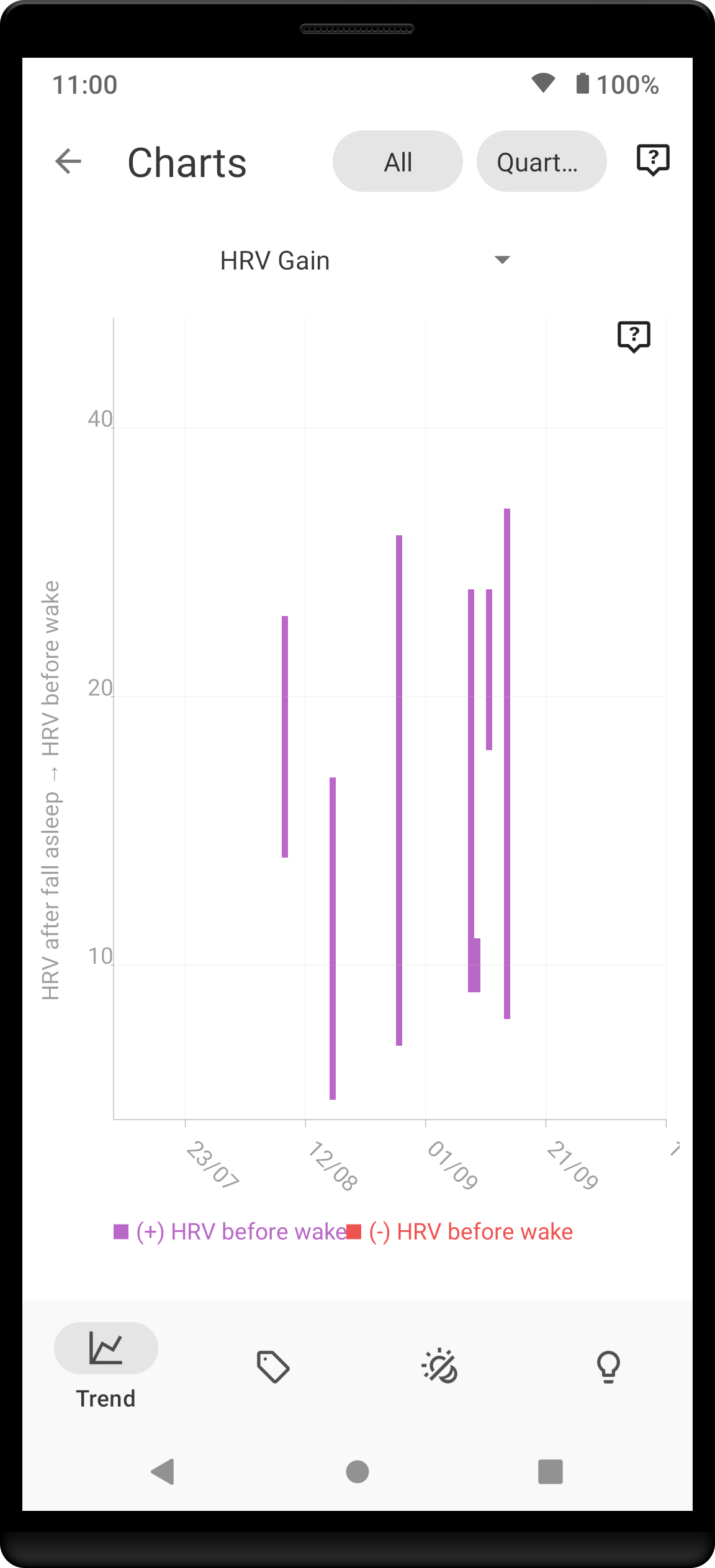
1.18. HRV Gain
|
HRV gain chart shows the difference between your HRV measured during the first low activity period (hrv before) of your sleep and the HRV measure at the last low activity period before awake up (hrv after).
How should it look? |
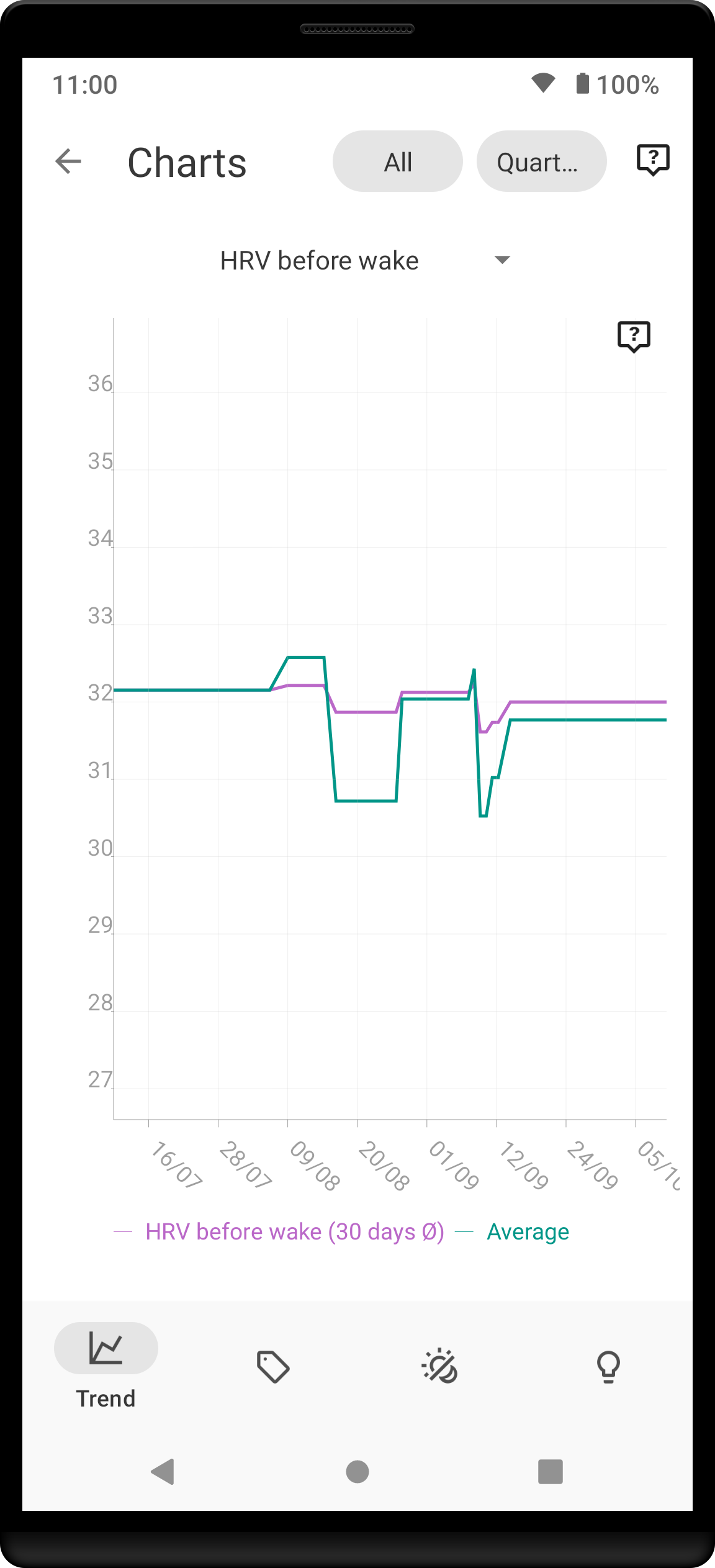
1.19. HRV Before wake up
|
HRV Before wake up chart shows HRV before wake up for given day (when date range is quarter-year or lower) or a 30-day average (when date range is half-year or higher).
How should it look? |
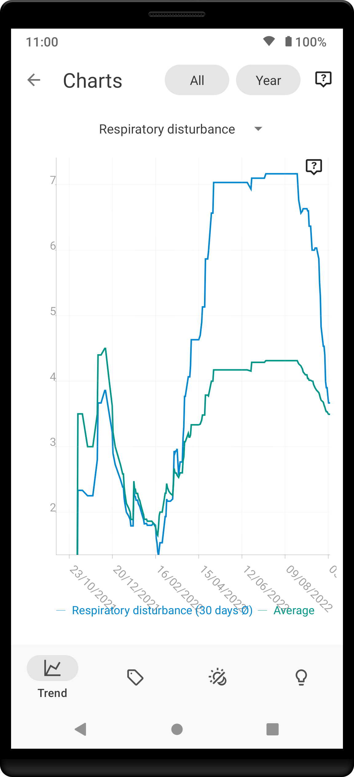
1.20. Respiratory disturbances
|
Respiratory disturbances chart shows the sum of the respiratory disturbances.
How should it look? Ideally, there are almost no respiratory disturbance during you sleep, so a flat line reaching close to zero. |
2. Tags
This section shows you characteristics of all sleeps that have a certain tag. You can for example find out whether your snoring is higher on sleeps that have an #alcohol tag, or whether rating is higher on sleeps with #sport tag.
Each chart also includes the average value of all your sleeps for reference.
|
|
This section shows only sleeps that have at least one tag. |
|
|
You can further filter the sleeps by another tag in the top menu! |
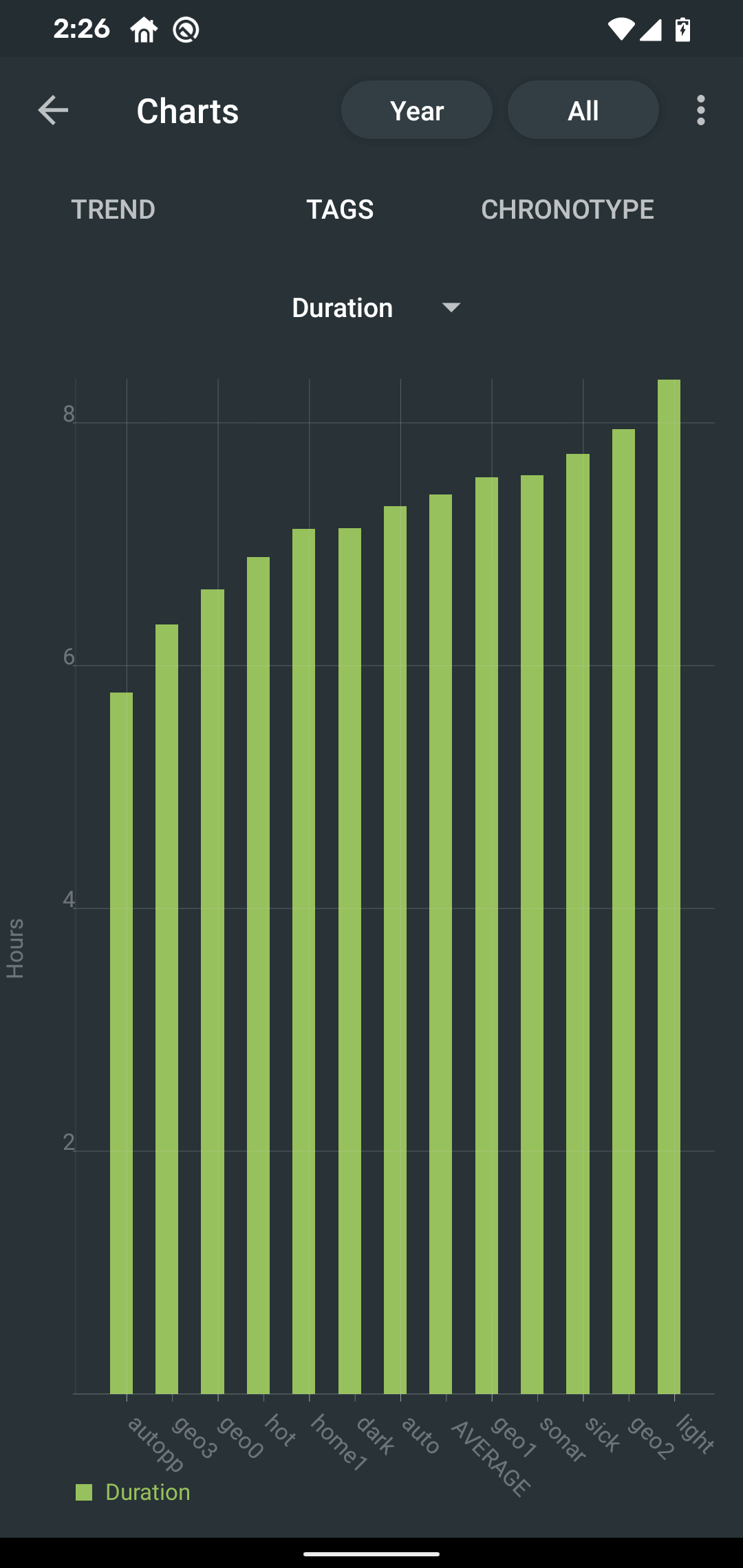
2.1. Duration
|
Shows average durations (in hours) of sleeps with a certain tag. |
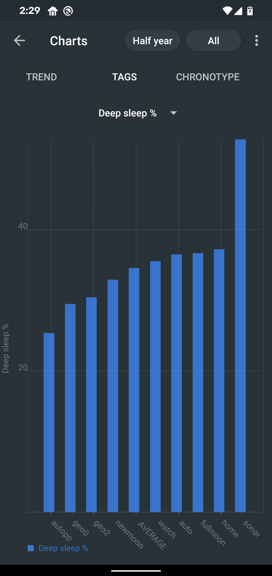
2.2. Deep sleep %
|
Shows average deep sleep percentage of sleeps with a certain tag. |
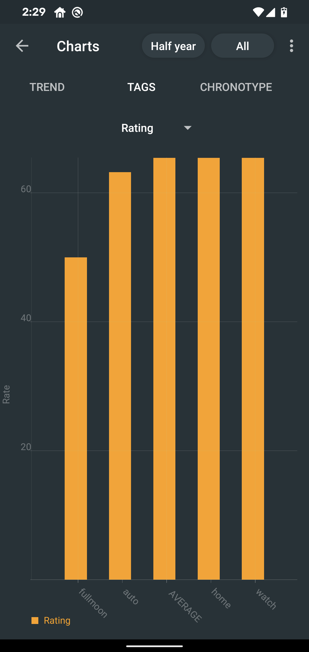
2.3. Rating
|
Shows average rating of sleeps with a certain tag. |
2.4. Snoring
Shows average snoring durations (in minutes) of sleeps with a certain tag. |
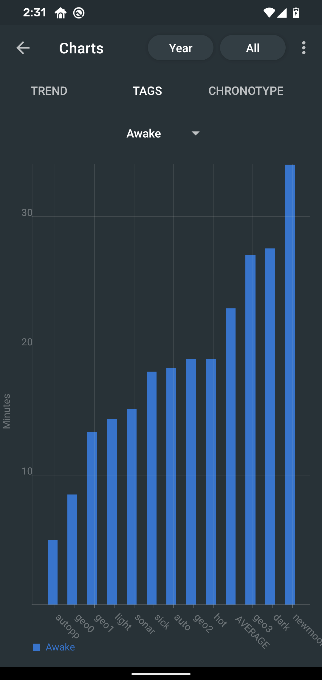
2.5. Awake
|
Shows average awake durations (in minutes) of sleeps with a certain tag. |
3. Chronotype
Chronotype is a term used to characterise your sleep patterns. It is a spectrum ranging from 100% night owl to 100% morning lark. Read more on Chronotype.
|
|
Chronotype statistics need least a month of sleep data. |
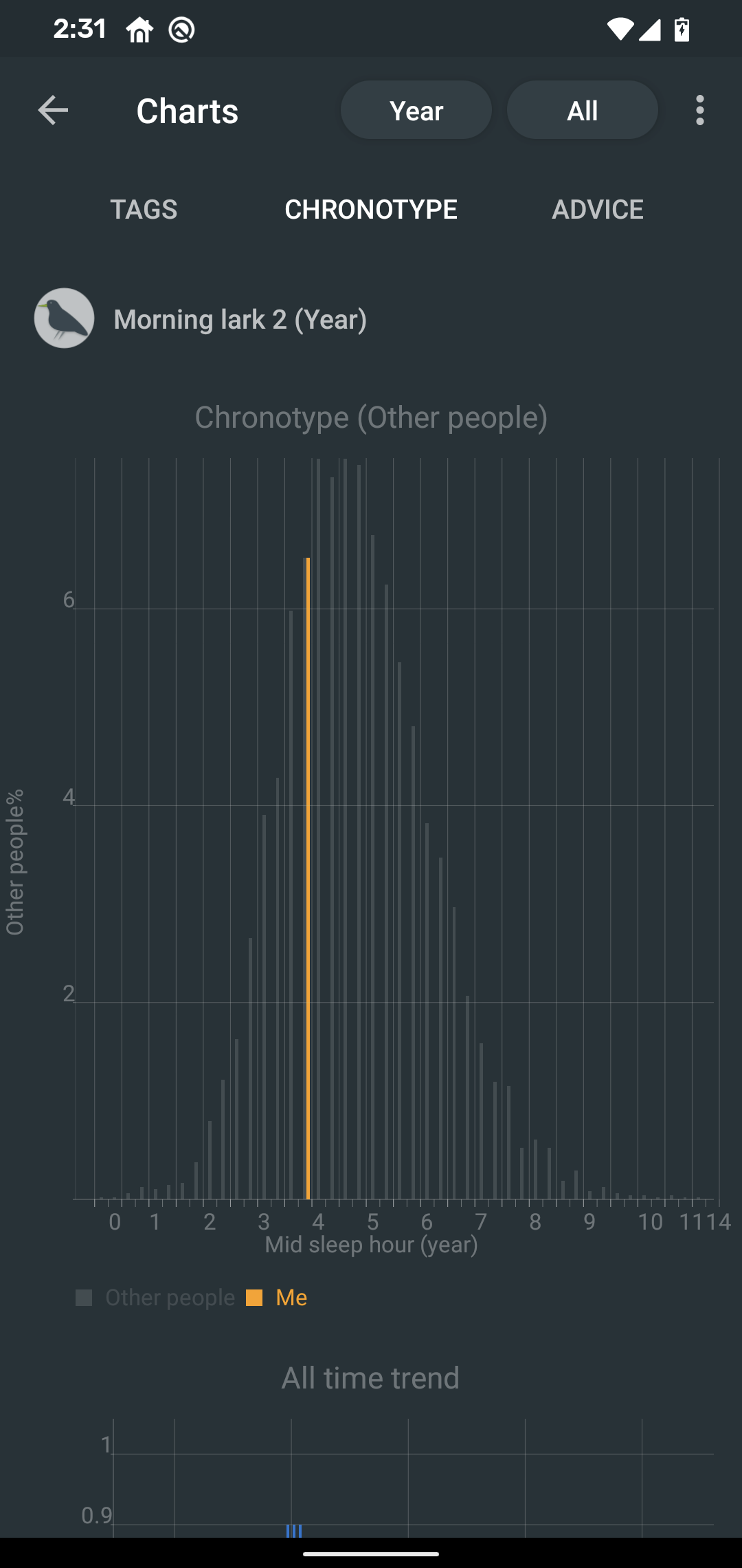
3.1. Mid-sleep hour
|
Shows where your all-time average mid-sleep hour stands in comparison to other people (data taken from SleepCloud). Your mid-sleep hour is highlighted. If your mid-sleep hour is more to the right, you are a night owl. If it’s more to the left, you’re a morning lark. |
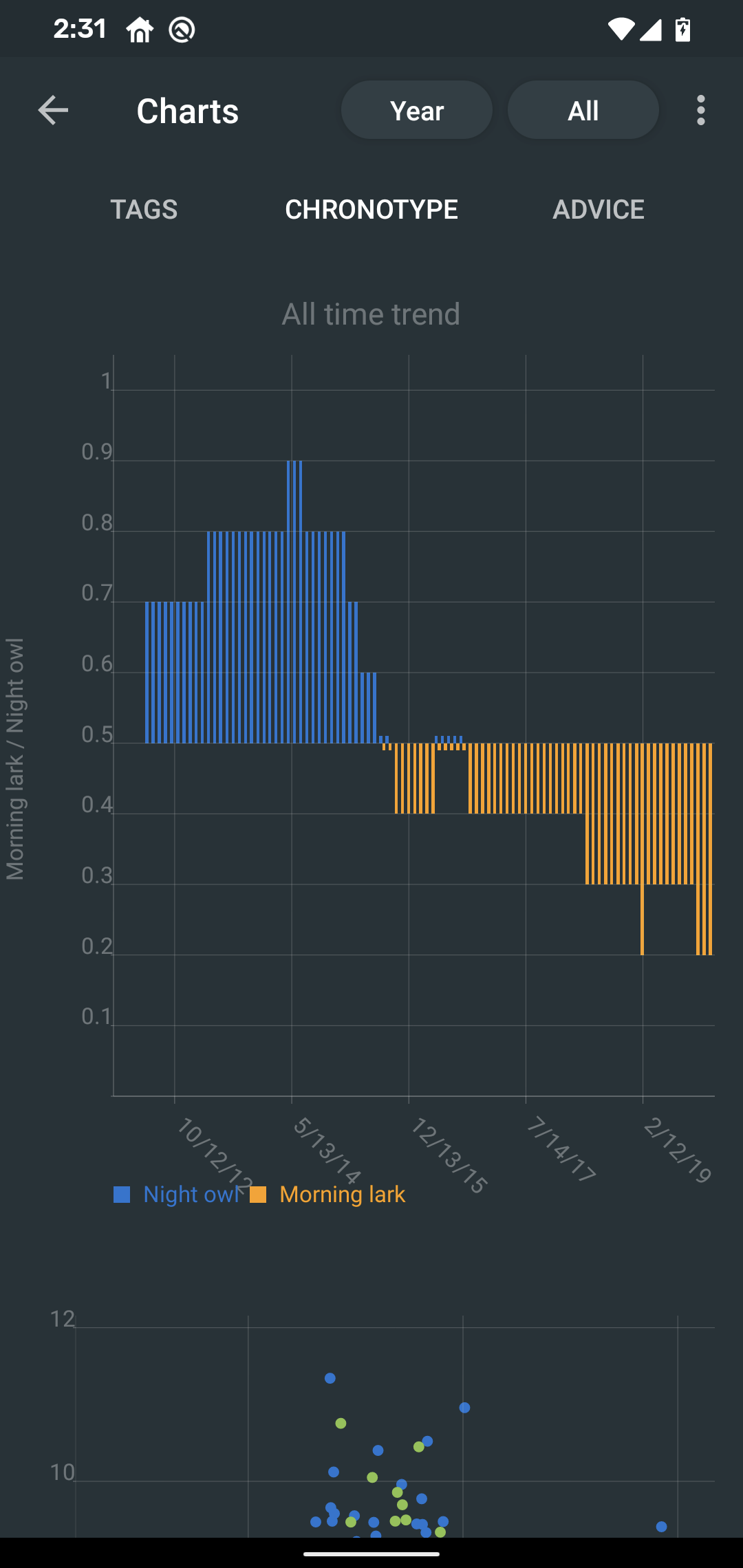
3.2. Chronotype trend
|
Shows the evolution of your chronotype. If you switched chronotypes at some point, there might’ve been some specific event like job change etc. |
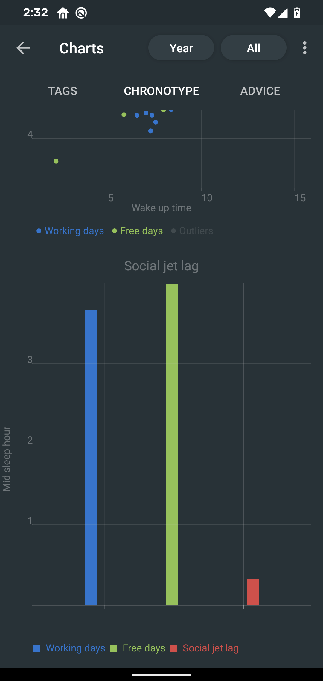
3.3. Social jetlag clusters
|
Shows your sleeps as points in an XY graph, in order to find your social jet lag.
Most importantly, the sleeps are divided into two clusters - Working days and Free days (see explanation) How should it look? Ideally, the two clusters should be very close together, indicating that your social jet lag is very low. |
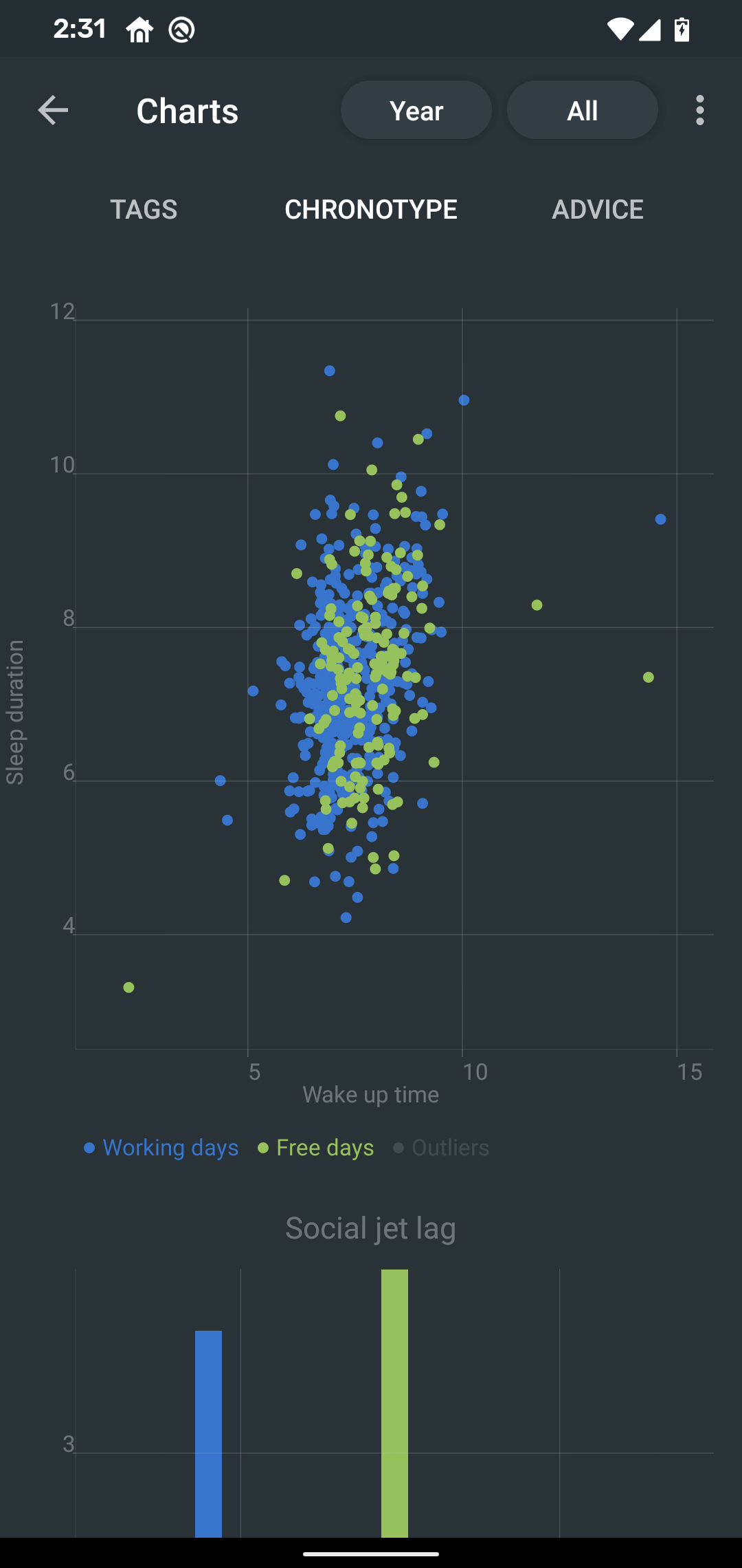
3.4. Social jetlag
|
Shows you mid-sleep hour on free days and workdays, and your social jet lag. How should it look? Ideally, the two leftmost bars should be very similar in height, so your social jet lag would be very low. |
4. Advice
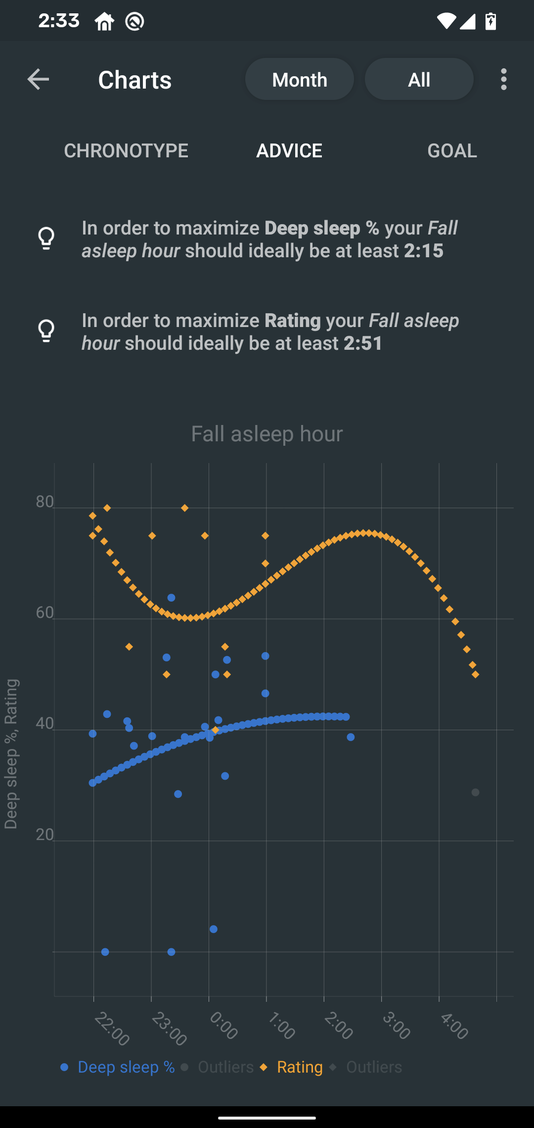
4.1. Fall asleep hour regression model
|
Fall asleep hour regression model is a chart that helps you decide when you should go to sleep. The aim of this chart is to show you how changes in your fall asleep hour will affect your rating and deep sleep %. How do we know that? A regression model takes the existing (historical) data, filters out outliers (i.e. extreme values) and then finds a mathematical formula that best fits that data. On the basis of this formula, it is possible to statistically predict future behavior. You can see two sets of points, and up to two curves.
What to do with this?
Take a look at the curve (either blue or orange) and focus on the maximum point or points. At what position (what fall asleep hour) it is? You should go to bed at this hour in order to maximize your deep sleep % (in case of blue line) or rating (in case of orange line). |
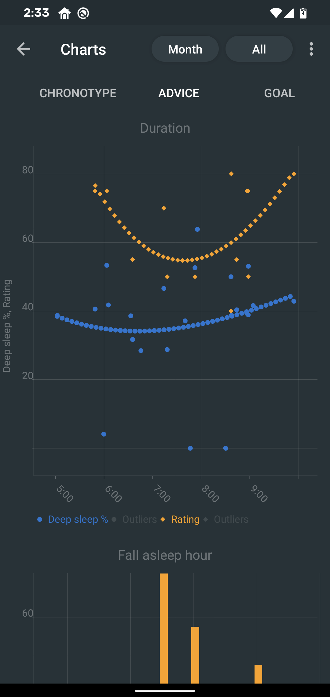
4.2. Duration regression model
|
Duration regression model is a chart that gives you advice on how long should you sleep. The aim of this chart is to show you how changes in your sleep duration hour will affect your rating and deep sleep %. How do we know that? A regression model takes the existing (historical) data, filters out outliers (i.e. extreme values) and then finds a mathematical formula that best fits that data. On the basis of this formula, it is possible to statistically predict future behavior. You can see two sets of points, and up to two curves.
What to do with this?
Take a look at the curve (either blue or orange) and focus on the maximum point or points. At what position (what sleep duration) it is? You should try to sleep for that long in order to maximize your deep sleep % (in case of blue line) or rating (in case of orange line). |
4.3. Fall asleep hour vs. deep sleep % / rating
Shows you average values of deep sleep % / rating for sleeps that started at a given fall asleep hour. |
4.3.1. Fall asleep hour vs. sleep duration
Shows you average values of sleep duration for sleeps that started at a given fall asleep hour. |
4.3.2. Weekday vs. deep sleep % / rating
Shows you average values of deep sleep % / rating for sleeps that started at a given day. |
4.3.3. Weekday vs. sleep duration
Shows you average values of sleep duration for sleeps that started at a given day. |
4.3.4. Fall asleep hour vs. snoring
Shows you average values of snoring for sleeps that started at a given fall asleep hour. |